I love looking at satellite images of the Antarctic and picking out the icebergs. In the last few years we have had great stories about the giant icebergs A68 in 2020, A76 in 2022 and most recently A23a currently in the Southern Scotia Sea.
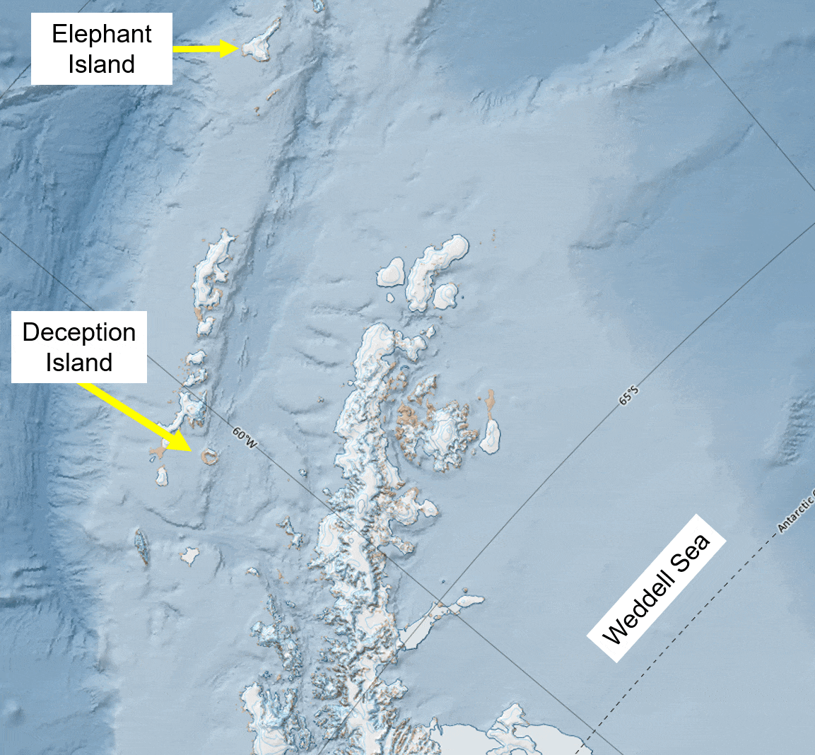
At the moment there are two of very large icebergs at the southern end of Antarctic Sound. Here is a map to orientate yourself and show where they are.
A basemap with a MODIS image from 7 October 2024. The yellow box is the location of Antarctic Sound and is expanded on below.
The Icebergs blocking Antarctic Sound
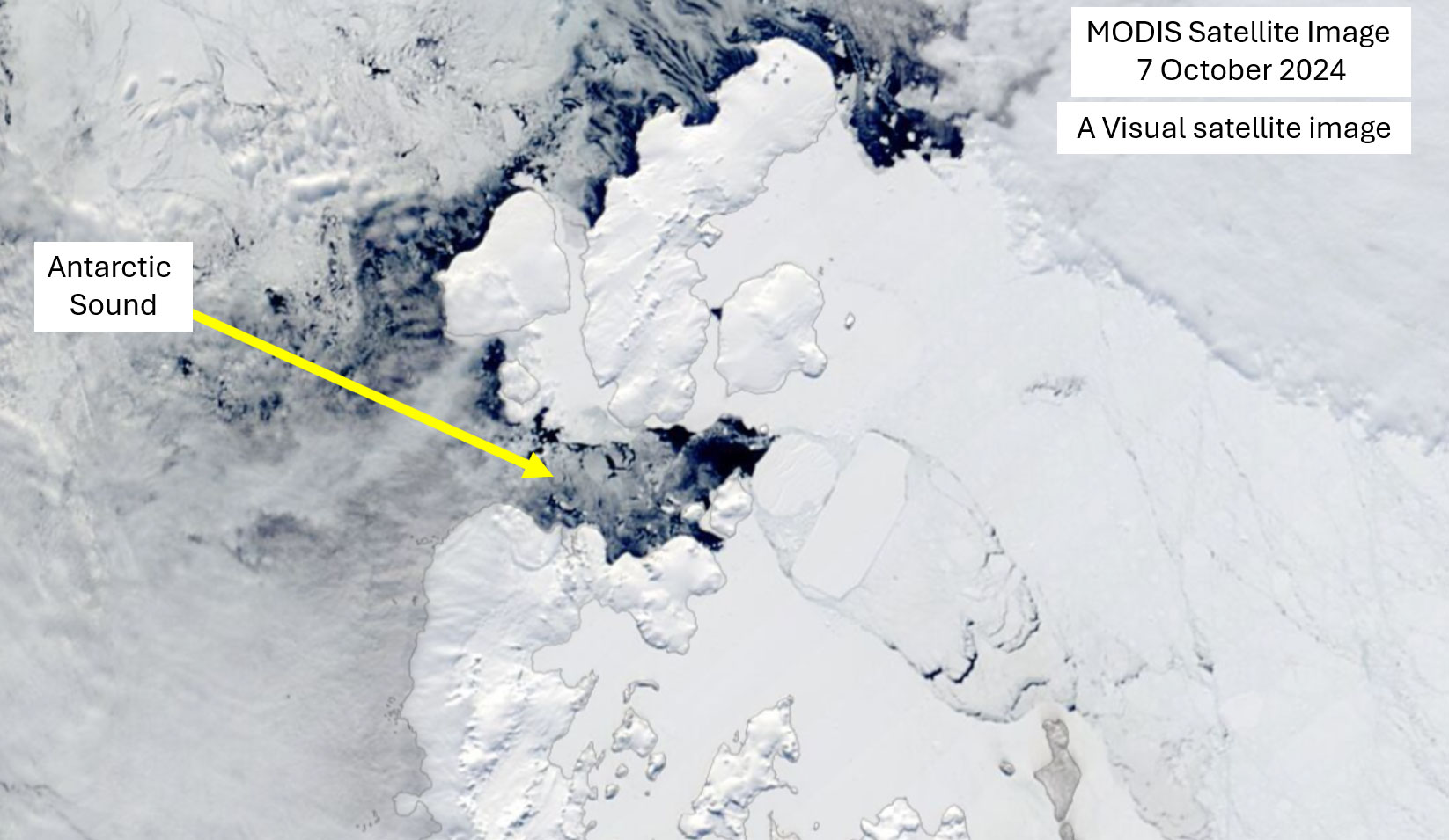
There is a lot in the image above. As well as the Antarctic Peninsula there are clouds, sea ice, and icebergs. Zooming into Antarctic Sound shows the giant icebergs more clearly.
A MODIS satellite image of Antarctic Sound taken on 7 October 2024. Two large icebergs are at the southern end of the Sound. These are A80A and A76C.
And in the radar sensor on Sentinel-1 the icebergs leap out because that sensor "sees" through the clouds.
A Sentinel-1 SAR image from 8 October 2024. Land is coloured blue, the giant icebergs are solid grey, and sea ice and smaller icebergs make up the grey shades colouring the rest of the image.
A80A is 10×9 nautical miles and it calved from the Larsen D Ice Shelf in November 2022. A76C is currently 16×7 nautical miles and was part of iceberg A76 that calved from the Ronne Ice Shelf in May 2021. These are pretty decent sized icebergs: A80A looks to be pinned against Rosamel Island and Andersson Island at the southern end of Antarctic Sound, and A76C grounded against A80A.
Personally I would be surprised if they broke out before the start of the Antarctic season proper, so they could cause some complexities in navigating into the Weddell Sea through Antarctic Sound.
A23a is still in the Southern Scotia Sea
Finally we can't forget the current monster of them all: A23A at 40×32 nautical miles, and it has been spinning above Pirie Bank north of the South Orkney's since April 2024. I described it as "the iceberg that just refuses to die" when I spoke to the BBC, and it has been spinning for seven months in pretty much the same location. When it finally breaks free, it'll head up towards South Georgia and it's inevitable demise rapid demise.
It's amazing to think that A23A has been in existence since 1986 when it fractured from the Filchner-Ronne Ice Shelf.
The summary? It looks like if you're going South this season you could see some very big icebergs, and navigation could be complicated in the North West Weddell Sea.
Based on almost 7,000 peer-reviewed research articles, the report is a cutting-edge crash course in how human-caused climate breakdown is changing our ice and oceans and what it means for humanity and the living planet. In a nutshell, the news isn’t good.
Cryosphere in decline
Most of us rarely come into contact with the cryosphere, but it is a critical part of our climate system. The term refers to the frozen parts of our planet – the great ice sheets of Greenland and Antarctica, the icebergs that break off and drift in the oceans, the glaciers on our high mountain ranges, our winter snow, the ice on lakes and the polar oceans, and the frozen ground in much of the Arctic landscape called permafrost.
The cryosphere is shrinking. Snow cover is reducing, glaciers and ice sheets are melting and permafrost is thawing. We’ve known this for most of my 25-year career, but the report highlights that melting is accelerating, with potentially disastrous consequences for humanity and marine and high mountain ecosystems.
At the moment, we’re on track to lose more than half of all the permafrost by the end of the century. Thousands of roads and buildings sit on this frozen soil – and their foundations are slowly transitioning to mud. Permafrost also stores almost twice the amount of carbon as is present in the atmosphere. While increased plant growth may be able to offset some of the release of carbon from newly thawed soils, much will be released to the atmosphere, significantly accelerating the pace of global heating.
Sea ice is declining rapidly, and an ice-free Arctic ocean will become a regular summer occurrence as things stand. Indigenous peoples who live in the Arctic are already having to change how they hunt and travel, and some coastal communities are already planning for relocation. Populations of seals, walruses, polar bears, whales and other mammals and sea birds who depend on the ice may crash if sea ice is regularly absent. And as water in its bright-white solid form is much more effective at reflecting heat from the sun, its rapid loss is also accelerating global heating.
Glaciers are also melting. If emissions continue on their current trajectory, smaller glaciers will shrink by more than 80% by the end of the century. This retreat will place increasing strain on the hundreds of millions of people globally who rely on glaciers for water, agriculture, and power. Dangerous landslides, avalanches, rockfalls and floods will become increasingly normal in mountain areas.
Rising oceans, rising problems
All this melting ice means that sea levels are rising. While seas rose globally by around 15cm during the 20th century, they’re now rising more than twice as fast –- and this rate is accelerating.
Thanks to research from myself and others, we now better understand how Antarctica and Greenland’s ice sheets interact with the oceans. As a result, the latest report has upgraded its long-term estimates for how much sea level is expected to rise. Uncertainties still remain, but we’re headed for a rise of between 60 and 110cm by 2100.
Arctic sea ice is melting at an unprecedented rate, contributing to sea level rise.
Netta Arobas/Shutterstock
Of course, sea level isn’t static. Intense rainfall and cyclones – themselves exacerbated by climate breakdown – can cause water to surge metres above the normal level. The IPCC’s report is very clear: these extreme storm surges we used to expect once per century will now be expected every year by mid-century. In addition to rapidly curbing emissions, we must invest millions to protect at-risk coastal and low-lying areas from flooding and loss of life.
Ocean ecosystems
Up to now, the ocean has taken up more than 90% of the excess heat in the global climate system. Warming to date has already reduced the mixing between water layers and, as a consequence, has reduced the supply of oxygen and nutrients for marine life. By 2100 the ocean will take up five to seven times more heat than it has done in the past 50 years if we don’t change our emissions trajectory. Marine heatwaves are also projected to be more intense, last longer and occur 50 times more often. To top it off, the ocean is becoming more acidic as it continues to absorb a proportion of the carbon dioxide we emit.
Collectively, these pressures place marine life across the globe under unprecedented threat. Some species may move to new waters, but others less able to adapt will decline or even die out. This could cause major problems for communities that depend on local seafood. As it stands, coral reefs – beautiful ecosystems that support thousands of species – will be nearly totally wiped out by the end of the century.
Between the lines
While the document makes some striking statements, it is actually relatively conservative with its conclusions – perhaps because it had to be approved by the 195 nations that ratify the IPCC’s reports. Right now, I would expect that sea level rise and ice melt will occur faster than the report predicts. Ten years ago, I might have said the opposite. But the latest science is painting an increasingly grave picture for the future of our oceans and cryosphere – particularly if we carry on with “business as usual”.
The difference between 1.5°C and 2°C of heating is especially important for the icy poles, which warm much faster than the global average. At 1.5°C of warming, the probability of an ice-free September in the Arctic ocean is one in 100. But at 2°C, we’d expect to see this happening about one-third of the time. Rising sea levels, ocean warming and acidification, melting glaciers, and permafrost also will also happen faster – and with it, the risks to humanity and the living planet increase. It’s up to us and the leaders we choose to stem the rising tide of climate and ecological breakdown.
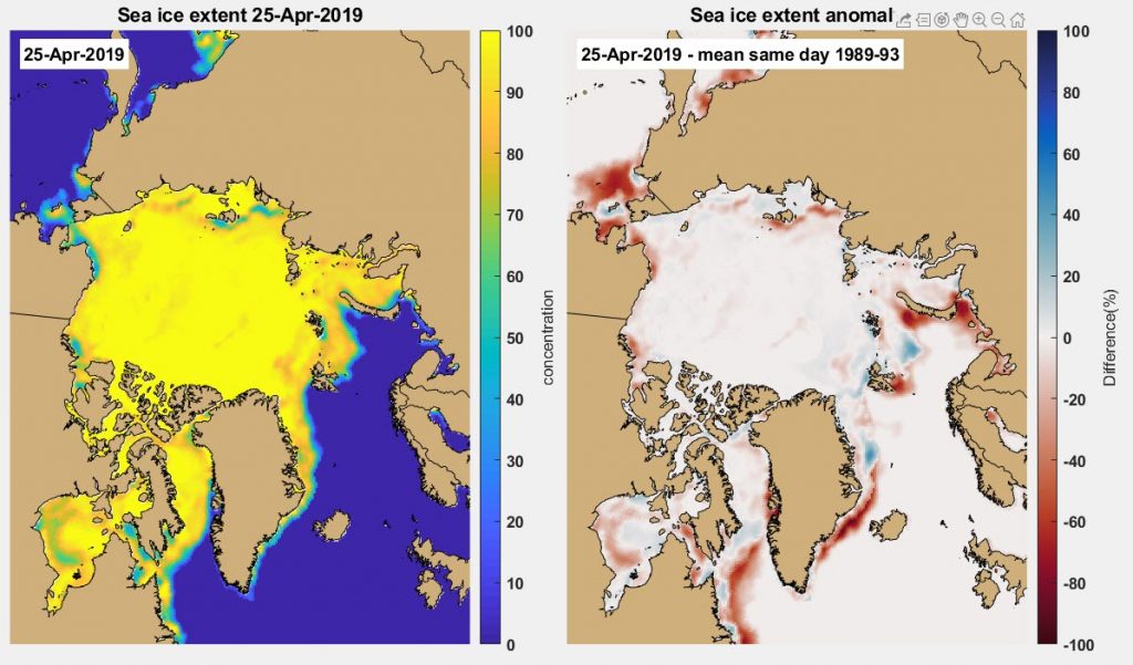
On 25th April 2019, the Arctic sea ice extent was 1.2 million km² below the 1981-2010 mean.
Sea ice in the Arctic currently ~1.2 million km² below the 1981-2010 mean. 25 April 2019.
If we compare the sea ice extent today, with the mean sea ice extent for the period 1989-93, the red colours show where there is currently relatively low sea ice.
The Arctic sea ice extent on 25 April 2019 (LHS), with the mean extent 25 April 1989-93. On the RHS blues = more sea ice than 89-93 mean, reds less sea ice.
As we expect the sea ice edge around virtually the whole Arctic has moved poleward compared with 1989-93, and there has been a lot written about the incredibly low sea ice extent in the Bering Sea over the last year year. For example this from twitter:
There is something significant going on in the Bering Sea: a very low ice extent for the second year in a row. pic.twitter.com/mrSlrT398Z
And of course this year follows on from the historic lows highlighted in spring 2018 by NASA.
Zooming in on Hudson Bay shows the current conditions there.
The Hudson Bay sea ice extent on 25 April 2019 (LHS), with the mean extent 25 April 1989-93. On the RHS blues = more sea ice than 89-93 mean, reds less sea ice.
On the west of Hudson Bay the sea ice is clearly 10-20% lower now than 1989-93 mean. With a quick comparison of two MODIS satellite images just 1 day apart, you can see that the sea ice is mobile.
MODIS images from 21 and 22 April 2019 showing the heavily fractured sea ice in Hudson Bay.
What I think is happening is that the spring break up is coming earlier. If you look at the science literature you can see that the cycle of sea ice in Hudson Bay. This is from de la Guardia et al. (2017). I have added the shaded yellow box to show the time period we are looking at. When spring comes earlier that drop off as the sea ice decreases in concentration moves to the left, so the result is the sea ice is low compared with the 1989-93 mean.
Sea ice concentration (SIC) climatology in Hudson Bay from 1979 to 2000 (mean 1 SD). Estimated with Canadian Ice Service monthly SIC data (CIS; solid line with open triangles), passive microwave satellite SIC data from Comiso (1999) (PMW-BS; dashed line with open circles) and Cavalieri et al. (1996) (PMW-NT; solid line with open squares), and model run using realistic atmospheric forcing fields (NCEP; dashed line with dots), and using atmospheric output from the CGCM 3.1 (T64) – 20C3M run (solid line with open circles). Figure 2 From de la Guardia et al. (2017)
The early break up is on trend with the literature as well. For example, all of the blue dots in the grid below (From Kowal et a; 2017) show a trend for earlier sea ice breakup over the time period 1971-2011. In that paper they also show a trend to later freeze up as well, meaning the sea ice season is getting shorter in Hudson Bay.
Fig. 9 Significance of points according to the Mann-Kendall trend analysis for current analysis using ice-free dates. *p<0.10 (yellow); **p<0.05 (red); ***p<0.01 (blue); p>0.10 (green; NS). Note in the counts of significant points, NS (green) and * (yellow) are considered not to be statistically significant. Thus, 31 points (red, blue) have statistically significant trends. From Kowal et al (2017).
Actually Kowal et al (2017) was pretty clear about the data:
[there is] evidence of an accelerated change in sea ice metrics temporal trends.
A recent paper by (Mudryk et al 2018) displays the Hudson Bay trend over time: It is 10.8% decrease in sea ice concentration per decade.
More than 10%!
Time series of summer total sea ice area for the (d) Hudson Bay regions from 1968 to 2016. FromMudryk et al (2018) Figure 7.
Hudson Bay is a well known for polar bears, and those bears rely on sea ice for significant components of their prey. de la Guardia et al. (2017) stated:
the links between sea ice decline and the future fate of polar bears have long been recognized.
Those authors looked at three possible CO₂ emissions pathways and they concluded that for:
two scenarios, predicted advances in breakup also threaten to decrease polar bear reproductive rate after 2060. If, however, we significantly reduce our GHG emissions and follow the low emission path of B1, polar bears may persist in WH [West Hudson Bay].
We expect to lose the summer sea ice in the high Arctic in the next couple of decades, we could expect an impact on the West Hudson Bay polar bears not long after.
References
Castro de la Guardia, L., Derocher, A. E., Myers, P. G., Terwisscha van Scheltinga, A. D., & Lunn, N. J. (2013). Future sea ice conditions in Western Hudson Bay and consequences for polar bears in the 21st century. Global Change Biology, 19, 2675–2687. WEBLINK
Kowal, S., Gough, W. A., & Butler, K. (2017). Temporal evolution of Hudson Bay Sea Ice (1971–2011). Theoretical and Applied Climatology, 127(3), 753–760. WEBLINK
Mudryk, L. R., Derksen, C., Howell, S., Laliberté, F., Thackeray, C., Sospedra-Alfonso, R., et al. (2018). Canadian snow and sea ice: historical trends and projections. The Cryosphere, 12(4), 1157–1176. WEBLINK
Just over a year ago in July 2017 iceberg A68 calved from the Larsen C Ice Shelf. I appeared on BBC News before it actually calved explaining what was happening.
At first A68 was slow to move and as I predicted back then, it likely got stuck on the sea bed (we say "grounded"). It has stayed pretty much in the same place through to July 2018.
But now A68 has started to swing northwards.
As the light is coming back to Antarctica, at high latitudes visual imagery is very washed out. But if we look at other data such as the brightness temperature, you can see some striking features.
Corrected Reflectance (True Color) from the Suomi NPP Visible Infrared Imaging Radiometer Suite (VIIRS), and the Brightness Temperature (Band I5, Day). Image from 20 August 2018.
With the brightness temperature data set, brighter colours indicate higher temperatures. The Larsen Ice shelf and A68a are glacial ice and so cold, they appear dark purple. The sea ice is thinner and warmer and in contact with the ocean so the purple shade is lighter. The leads which are cracks in the sea ice and so open water and / or very thin sea ice appear as relatively bright lines. On the bottom right of that image you can see that under certain circumstances the brightness temperature data set can see through clouds.
The Danish ship Venta Maersk, (Maersk Line, ice-class Baltic feeder vessel of 3,600 containers) is going to attempt to transit across the Kara Sea, the Laptev Sea and the East Siberian Sea.
Maersk said: "The trial passage will enable us to explore the operational feasibility of container shipping through the Northern Sea Route and to collect data."
There is generally a lot happening in Arctic sea ice news at this time of the year as we head to the annual summer minimum extent, and current sea ice extent is currently about 1.6 million km2 below the 1981-2010 mean.
Sea ice in the Arctic currently about 1.6 million km2 below the 1981-2010 mean. 21 August 2018.
Given that the trend of minimum ice extent has been relentlessly downwards since the start of the satellite record:
Annual Arctic minimum sea ice extent. Data from from NSDIC.
we could expect the Venta Maersk to have potentially an easy passage.
But that is rarely true in polar seas - even at the height of what will be the Arctic summer.
A look at the distribution of the current sea ice extent is interesting.
Arctic sea ice 21 August 2018, mean Arctic sea ice 21 August 1989-93 and difference between the two. Reds indicate absence of sea ice compared to the older data and blues indicate increased. The yellow box indicates a region where there is much more sea ice than we could expect.
There is more sea ice in the East Siberian Sea than we could expect (~40% more than the 1989-93 mean), and a look at the latest "near real time" (end of April 2018) ice thickness data from CPOM show that the ice in this region was quite thick at the start of the summer melt season.
Arctic sea ice thickness processed at UCL from CryoSat's SAR mode data: NOTE THIS IS END OF APRIL 2018. NRT Service Suspended during Arctic summer (May-Sept).
It is possible the Venta Maersk could find the going slow, but she is a polar rated ship designed to work in the Baltic, and by staying close to the coast she could avoid the ice completely.
It is an interesting way to move a Baltic ship from it's build location in China to its planned operational area, and one to watch over the next month.
Interestingly if you look at the Cryosat sea ice thickness map north of Greenland you can see that at the end of the winter the sea ice thickness was already relatively low. (See the story in the Guardian: Arctic’s strongest sea ice breaks up for first time on record). The thickest sea ice is further to the west north of the Canadian Arctic Archipelago.
Arctic sea ice thickness processed at UCL from CryoSat's SAR mode data: NOTE THIS IS END OF APRIL 2018. NRT Service Suspended during Arctic summer (May-Sept).
I love watching the opening of a polynya in satellite data. This is North Water at the NW tip of Greenland expanding over 6 days. You can see the wind is to the SW and it is both pushing the mobile sea ice away from the fast ice of Nares Strait (the strait is named for George Nares), and the growth of new sea ice.
The Opening of North Water 9-14 May 2018.
This is the location of North Water. It is a famous polynya and important for the local wildlife and first peoples.
The location of the polynya region.
The image below from the 14 May 2018 shows streaks of frazil ice. So what you can see is as well as the wind pushing the sea ice away from the fast ice, new sea ice is being generated.
North Water on the 14 May 2018 showing frazil ice streaks.
This is a MODIS image from 2004, but it's too good not to post here.
Iceberg A38 at South Georgia 12 April 2004
I'm giving a talk tonight for the South Georgia Association called Giant Icebergs and South Georgia, so I'm wandering through a lot of these images at the moment.
South Georgia is a small island approximately 190 x 30 km within the Antarctic Circumpolar Current in the South Atlantic. It has a continental shelf that extends more than 50 km from the coast with average depth ~200 m, although there are deeper submarine canyons.
Iceberg A68 calved from the Larsen C ice shelf earlier this year. I wrote about before.
As the berg calved it is starting to reveal a patch of seafloor that has been covered by thick glacial ice, and as the BAS press release says this has revealed:
a mysterious marine ecosystem that’s been hidden beneath an Antarctic ice shelf for up to 120,000 years.
To have the chance of making observations in an untouched environment like that is so exciting, that the British Antarctic Survey are running an expedition to investigate. You can read about it in a great piece by Victoria Gill on the BBC news site, and the brilliant Katrin Linse has done some great work with Radio 4 and the BBC Breakfast program (2hrs 20 mins in source BAS twitter account) explaining both the purpose and the work.
I was looking this morning at the recent Sentinel-1 imagery on Polarview, this is an image of A68 captured on 11 February 2018. It's big - about 5,200 km2.
Iceberg A68 and the Larsen C Ice shelf captured from with the Sentinel-1 SAR sensor 11 February 2018.
I labelled some features in the image: the iceberg and the ice shelf are the relatively solid grey colour. The blue overlay is where land and the ice shelf roughly were (it's called a land mask).
One thing you can see is the speckled grey colour which covers the top right hand side.
This speckled grey is sea ice.
It's a relatively thin cover of a typically 1-3 m thick.
Antarctic Sea ice.
If you map the current sea ice distribution, and the location of iceberg A68 you can see how much sea ice they are going to have to sail through to reach the region.
Larsen C, the iceberg A68 and the sea ice extent on 11 February 2018.
There is a lot of high concentration sea ice between the ice edge and the iceberg that the ship will have to traverse. RRS James Clark Ross is a very capable ship, and she will be able to make way through the ice.
The issue is this can take a lot of time.
And time whilst ice breaking is fuel.
In open water a research ship can cover ~22 km per hour, in sea ice if you are breaking ice then maybe 5 km per hour would be good, and you probably wouldn't break ice 24 hours per day.
They have 3 weeks.
Plus if you sail 400 km in the ice, unfavourable winds can easily compress the sea ice and trap a ship. It's happened before, and in the modern era even capable ships get can get held up.
The satellite I used to make the image doesn't do so well in coastal regions, so given some favourable winds there could be a nice channel for them. I am going to be watching the visible satellite imagery for that.
It's easy to make pronouncements from 14,000 km away, but really the people on the ground will work it out.
Whatever happens I know that the researchers on board will do some great research. Plus I would be surprised if A68 moves too far from the region in the next year.
Breaking ice in Antarctica.
Breaking Antarctic sea ice on the RRS James Clark Ross.
Being interested in the Weddell Polynya I plotted some time series data from 1 September 2017 to 23 November 2017. On the left-hand panel, you can see the see the sea ice concentration, on the right-hand panel, the anomaly of the concentration each day compared with a mean from 1989-93.
The Weddell Polynya is the low concentration region at approximately 12:00 in the movies below.
You can see the Weddell Polynya isn’t stationary.
You can also see the sea ice is still relatively low compared to the historic record. We should expect this after the extreme low sea ice from ~October 2016 onward.
Antarctic sea ice extent (with greater >15% sea ice cover) 23 November 2017. From NSIDC.
I will write some more about this next week but for interest here is the Antarctic sea ice extent anomaly for 2017.
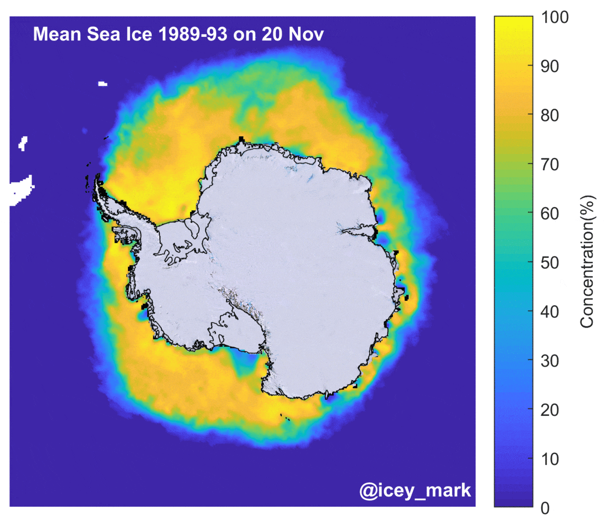
Antarctic sea ice extent remains low compared with the 1981-2010 median extent. This image shows the mean from 1989-93, the extent on 20 November 2017 and the difference between the two. Red colours imply that there is a decreased sea ice extent compared with the mean.
The mean Antarctic sea ice for the years 1989-93 on 20 Nov, the sea ice concentration on 20 Nov 2017 and the difference between the two data sets. Reds imply decreased sea ice compared with the mean, blue shades imply more. The original data come from the DMSP SMMI data set at the NSIDC.
Last month, SOCCOM scientists were astonished to discover that a float in the Weddell Sea had surfaced inside the polynya, making contact with satellites in the dead of winter. Its new ocean measurements, transmitted when it surfaced, are being analyzed as part of a study in preparation on Weddell Sea polynyas. With these new observations comes the possibility that the polynya’s secrets may finally be revealed.
We should expect some exciting research articles soon.
Sea ice extent currently ~1.2 million km2 low
The overall sea ice extent is currently ~1.2 million km2 below 1981-2010 median extent. This sounds a lot.
Antarctic sea ice extent (with greater >15% sea ice cover) 18 November 2017. From NSIDC.
But at this time of the year the Antarctic sea ice is about to dramatically fall as spring develops. If spring "arrives" early then the extent will - as we see, be relatively low.
Seasonal cycle of Antarctic sea ice extent
Whilst the full on development and opening of the Weddell / Maud Rise Polynya is unusual, if you compare the sea ice on 18 November 2017 with the extent from the same day on 1989-1995 it is clear that the extent is often lower over Maud Rise, at this time.
This is the sea ice on 18 November for 1989, 91, 92, 93, 94, 95 and 18 November 2017. The original data come from the DMSP SMMI data set at the NSIDC.
I will keep watching the sea ice as the summer season develops
MODIS mosaic from the AQUA satellite on 18 November 2017.
** UPDATED 20th November 2017 replacing the first figure from 17 November to 20 November.