Author Archives: Mark Brandon

With three of my Open University colleagues: Dr Phil Sexton, Dr Pallavi Anand, and Dr Mandy Dyson, I have been working in the background on a new landmark TV series called Blue Planet 2.


This incredible series has been made by the BBC Natural History Unit with the Open University as co-producers. It has seven stunning episodes and will be broadcast in the UK at the end of October 2017.

Yesterday was the World Royal Premiere at the BFI Imax with Sir David Attenborough, Prince William, Radiohead, Hans Zimmer, and a team of BBC program makers that is too long for this post.

The prequel above was released after the premiere.

Episode one one the big Imax screen was stunning, and just after there was a Q&A led by Liz Bonnin with some of the key people:

Sir David Attenborough, James Honeyborne, Orla Doherty, Mark Brownlow and Hans Zimmer.

Liz Bonnin interviewing Sir David Attenborough After the World Premiere of Blue Planet 2.

It's been a brilliant experience to work with so many incredible film makers - many of whom also have PhDs to go with their artistic and technical talent. You often hear about how the media want to tell their own story - but in my experience the NHU just want it to be the best - and, of course, correct.

I'm proud to have been a small cog in the mighty and incredible machine that made this series, and  I'm looking forward to seeing how it is received.

It has been an amazing experience to be one of four marine scientists at The Open University to have contributed to the series. As well as helping the production team we've been developing interactive learning materials and a poster for the general public and our students that will also be released at the end of October.

I hope the film makers get the awards I think they deserve for making such a powerful work.


3 Comments

The polynya over Maud Rise was visible in a beautiful clear MODIS image on 25 September. It is currently ~40,000 km2 of open water in the middle of the Antarctic winter sea ice. This will be some impressive heat loss.

MODIS image of the polyna over Maud rise on 25 Sept 2017. The black is ~40,000km2 of open water.

This is the polynya in the SMMI Data for the same day.

Location of Maud Rise polynya 25 Sept 2017.

A while back I calculated the heat loss through 2,000 km2 of open water in the Arctic as being ~600 GW. This is about 20 times as much open water…

As I said then, the heat loss is making the surface waters denser, so they sink away from the surface

More to come on this I expect.

7 Comments

Quick post on the Maud Polynya in the Weddell Sea that I wrote about last week. This is the sea ice data 17 September 2017, and the polynya is both clear and large.

The location of the polynya over Maud Rise. Sea ice data from DMSP SMMI.

An enlargement of the polynya shows that it is practically open water.

...continue reading

3 Comments

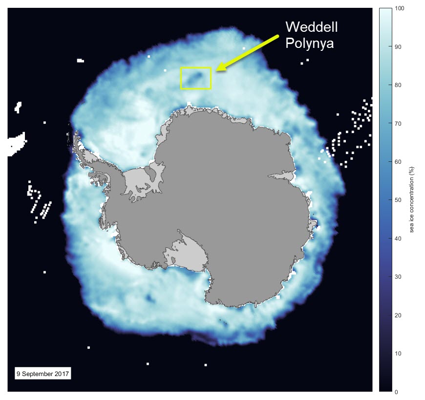
The Weddell Sea polynya is an area of open water that sometimes appears in the Weddell Sea over a relatively shallow region called Maud Rise.

The Antarctic sea ice concentration 9 September 2017. The location of the polynya is marked and the original data come from the DMSP SMMI data set at the NSIDC.

In the latest satellite imagery from the DMSP satellite you can see the lower concentration sea ice as the darker blue colour. If you look at the MODIS imagery for the same date you can clear see black which indicates open water in the pack ice.

The MODIS imagery mosaic of Antarctica from 7 September 2017 from the MODIS sensor on the Terra satellite. The pattern in the centre of the image is because high latitudes of Antarctica are still dark at this time in winter.

...continue reading

The sea ice in the Antarctic is at minimum extent in February and expands through to mid September.

This movie shows the Antarctic sea ice extent from 1 Feb to 25 July 2017. The data come from the DMSP SMMI sensor, and it shows the expansion of the sea ice as winter progresses.


For me the stand out feature is how late the sea ice expands in the Bellingshausen Sea. I think this is a feature of the super low sea ice last year, and the amount of time it took to lose the extra heat absorbed by the ocean.

The NSDIC data set shows the sea ice is lower than we've seen before by satellite.

Antarctic sea ice extent to 26 July 2017 from NSIDC.

Currently the Antarctic sea ice extent is ~450 thousand km2 below 1981-2010 median.

~7-8 weeks of sea ice expansion to go.

2 Comments

The sea ice in the Arctic is at maximum extent in February and retreats through to mid September.

This movie shows the Arctic sea ice extent from 1 Feb to 25 July 2017. The data come from the DMSP SMMI sensor, and it shows the retreat of the sea ice as summer progresses.

You can see from the NSDIC that Arctic sea ice extent is tracking close to the 2012 minimum, and about ~1.6 million km2 below 1981-2010 median.

Arctic sea ice extent to 26 July 2017 from NSIDC.

To see where the sea ice "isn't" you can see the gif I made for a post last week.

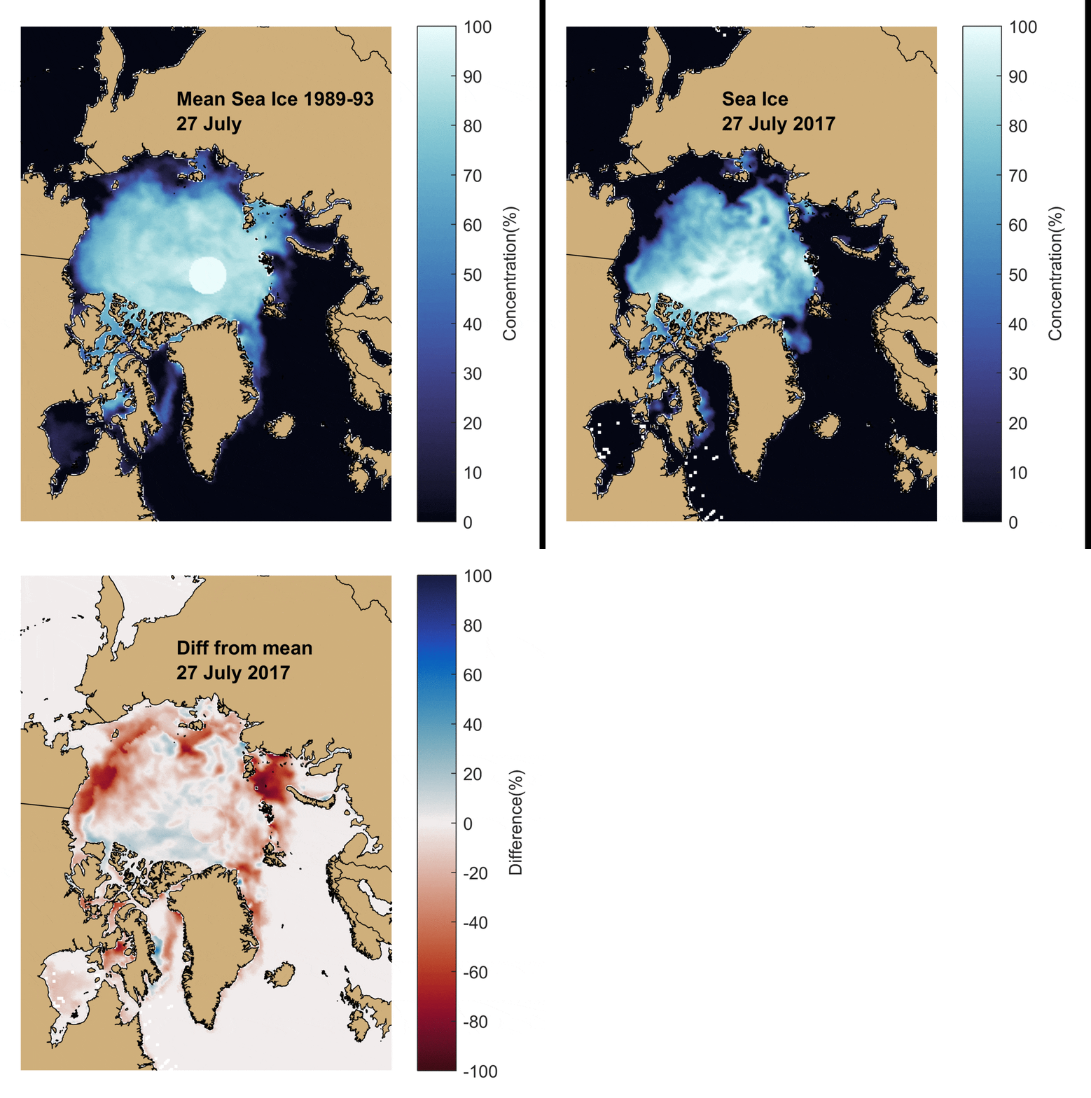
The mean Arctic sea ice for the years 1989-93 on 27 July, the sea ice concentration on 27 July 2017 and the difference between the two data sets. Blue shades imply more sea ice and reds imply decreased sea ice compared with the mean. The original data come from the DMSP SMMI data set at the NSIDC.

In that post I said

Things that stand out for me are the virtually open water in the Barents and Kara Seas.

~6-8 weeks of melt to go...

Today the NASA Earth Observatory Website has published a beautiful image from 29 June 2017 of Hudson Bay in a post called Lingering Sea Ice on Hudson Bay.

Lingering Sea Ice on Hudson Bay
Lingering Sea Ice on Hudson Bay. Image NASA Earth Observatory.

To the untrained eye the sea ice in the bay looks like cloud, but if you look at the still from the movie above on the same day, the sea ice is clear.

Hudson Bay 28 June 2017

The NASA blog post talks about how polar bears were hunting in this sea ice.


3 Comments

I thought it was time to look at the sea ice data as the summer Arctic melt proceeds.

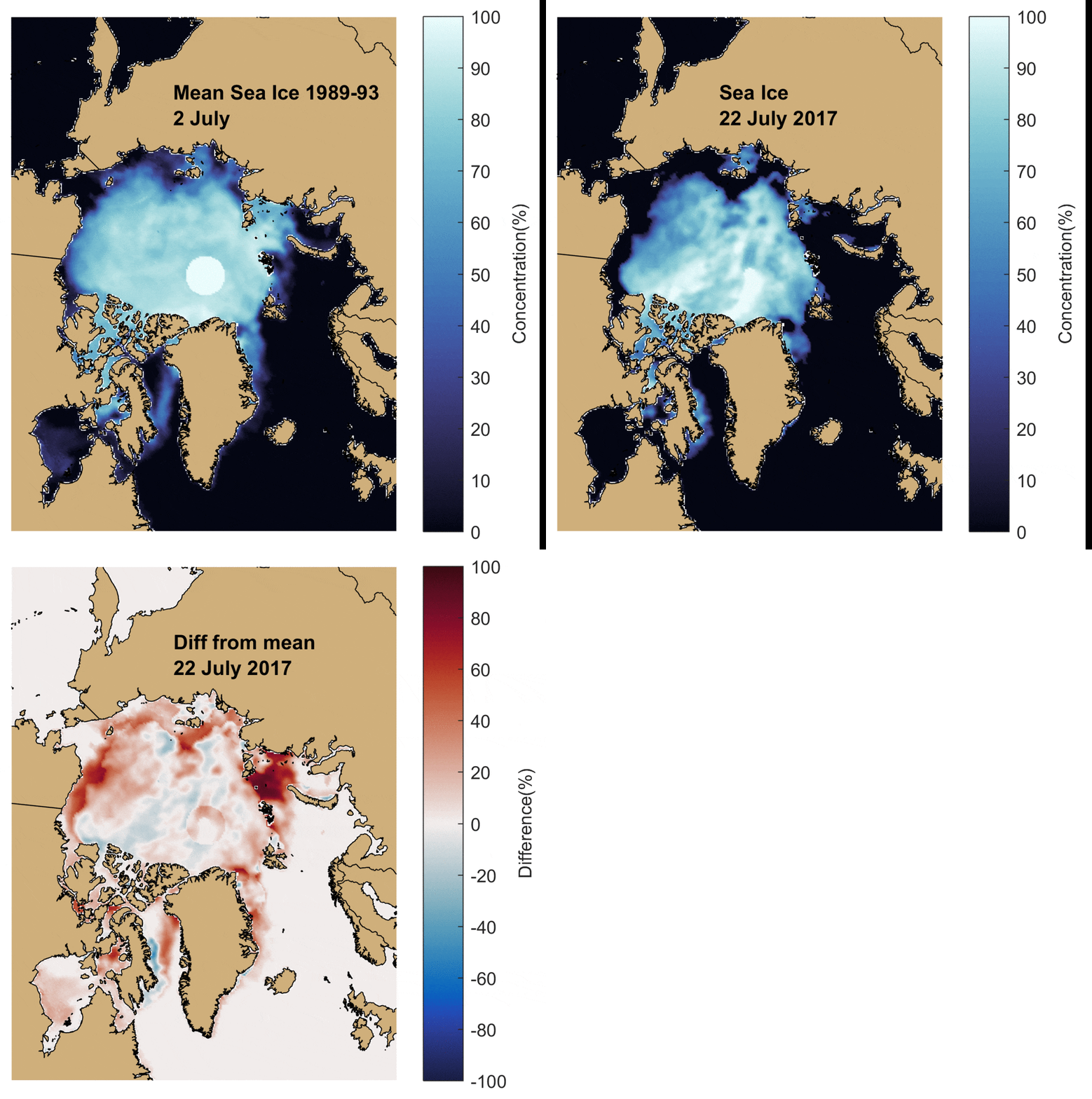
The image below shows the mean sea ice extent 1989-93 on 22 July, the sea ice extent 22 July 2017, and the difference between the two data sets. Reds imply less sea ice than the mean 1989-93, and blues an increased sea ice extent.

The mean Arctic sea ice for the years 1989-93 on 22 July, the sea ice concentration on 22 July 2017 and the difference between the two data sets. Blue shades imply more sea ice and reds imply decreased sea ice compared with the mean. The original data come from the DMSP SMMI data set at the NSIDC.

As we would expect, compared with the 1989-93 data the sea ice edge is consistently further north. Things that stand out for me are the virtually open water in the Barents and Kara Seas. This region was very slow to freeze over in the autumn and winter of 2016, so I would have expected the sea ice there to be relatively thin at the end of the Arctic winter.

Also the Chukchi Sea is opening.

Overall the area of the Arctic Ocean covered with sea ice is low. Some will note it is currently above the record low in 2012, but it's only 90,000 kmabove that. To me that is not that significant.

Arctic sea ice extent to 22 July 2017 from NSIDC.

What is significant is the sea ice 22 July 2017 is ~1.7 million kmbelow the median extent from 1981-2010.

I looked a couple of days ago at the sea ice in the North West Passage (19 July 2017), and it is starting to open up.

The North West Passage. Image 22 July 2017 from the Suomi National Polar-orbiting Partnership Visible Infrared Imaging Radiometer Suite.
The North West Passage. Image 19 July 2017 from the Suomi National Polar-orbiting Partnership Visible Infrared Imaging Radiometer Suite.

The yellow line traces out possible ship routes through the North West Passage and whilst there is still ~1200 km of sea ice on that route, when you compare the region to the longer term data you can see how low this is compared the historical record.

The difference in the sea ice in the NW Passage on 22 July 2017 compared with the mean for the years 1989-93 on 22 July. Blue shades imply more sea ice and reds imply decreased sea ice compared with the mean. The original data come from the DMSP SMMI data set at the NSIDC.

It may be this year that the passage may not open at all, but taken together the two plots are a a good example of how we can expect the north west passage to become consistently open as the Arctic continues to warm.


2 Comments

Project MIDAS shows us that the iceberg A68 is about one trillion tonnes.

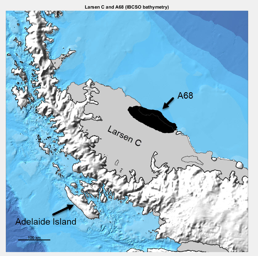
This is the Antarctic Peninsula and the outline of A68 from the satellite image on 14 July 2017 shown in black. The ice front is from the Bedmap2 data set (so a little out of date), and the bathymetry from the IBCSO data set.

Larsen C Ice shelf on the Antarctic Peninsula and the location and area of iceberg A68. The outline of A68 is derived from a satellite image of the ice shelf 12 July 2017.
Larsen C Ice shelf on the Antarctic Peninsula and the location and area of iceberg A68. The outline of A68 is derived from a satellite image of the ice shelf 14 July 2017.

There are some astonishingly beautiful processed satellite images of A68 out there such as this one via ESA from Adrian Luckman and the excellent Project MIDAS.

One image I haven't seen is how good is knowledge of the bathymetry around A68?

The iceberg is going to drift and likely ground quite quickly. (I wrote about this on the conversation a while ago: When an Antarctic iceberg the size of a country breaks away, what happens next?)

In the map below, the shaded colour is the distance of any point on the sea bed to the closest actual depth measurement.

The distance to the nearest good depth measurement around the Antarctic Peninsula.

So the dark blue stripes labelled in the Weddell Sea are actually ship tracks - and the dark colours are good depth data. These measurements will have been made by icebreaker.

Just in front of A68 there is a very large area where no ship has been within ~80 km.

One small note on the size. I digitized the iceberg from a satellite image (a KML File can be downloaded). On twitter today there were satellite images showing fractures already.

But Martin O'Leary of the MIDAS team posted today on twitter that to the untrained eye looks like iceberg, is very likely fast ice (so thick sea ice that is "fast" to A68 - but only a few metres thick.)

At this time of the year we should expect the Antarctic sea ice to be growing rapidly, but after the historic lows of last Antarctic summer, we can see that whilst it is rapidly advancing, the sea ice extent (the area of ocean covered by >15% of sea ice) it is still ~1 ¼ million km2 below the median from 1981-2010.

Antarctic sea ice extent (with greater >15% sea ice cover) 15 May 2017. From NSIDC.
Antarctic sea ice extent (with greater >15% sea ice cover) 13 May 2017. From NSIDC.

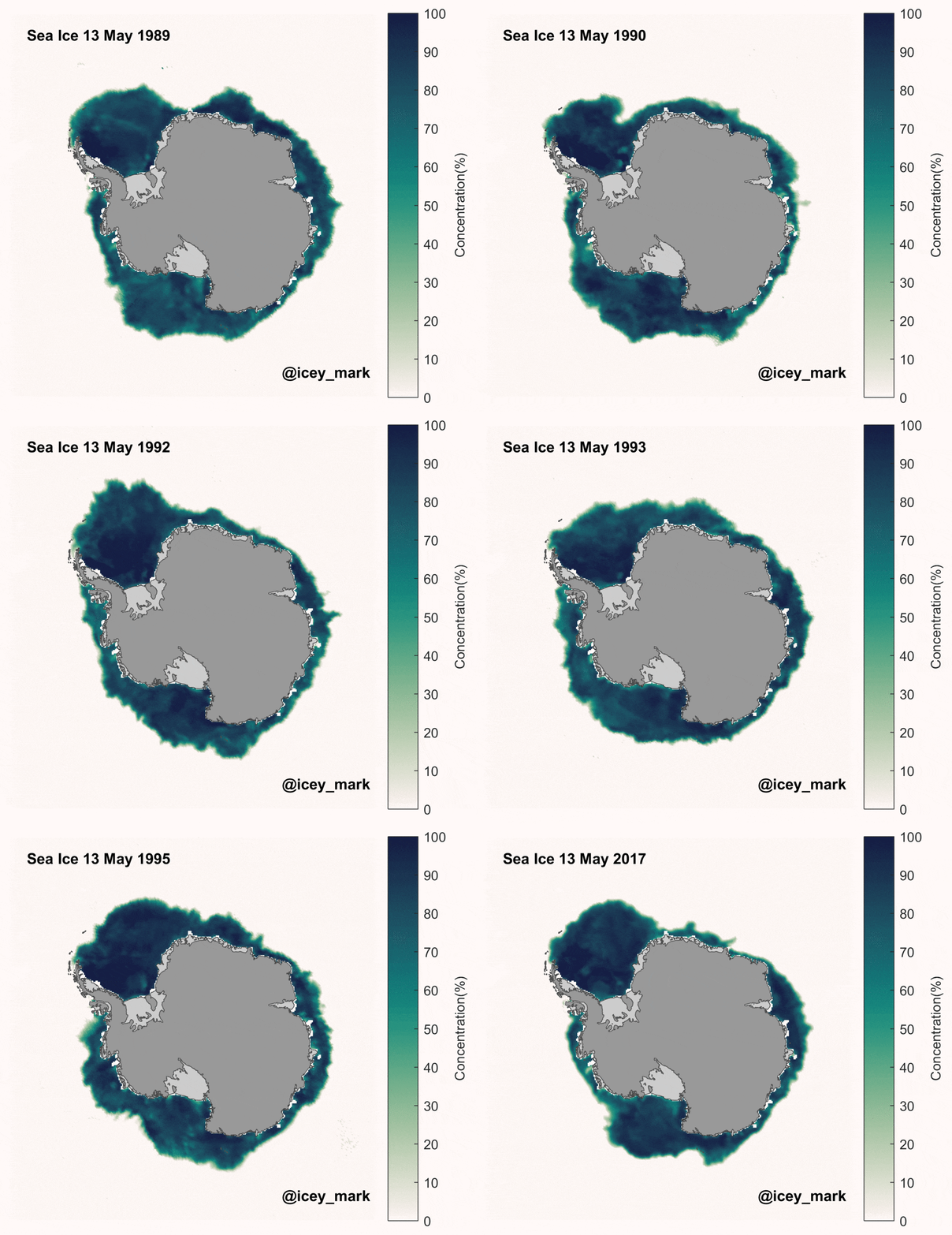
There is not a consistent trend in Antarctic sea ice extent, and much regional interannual variability. The plot below shows the sea ice extent on 13 May for each of the years 1989-95, and 13 May 2017.

Antarctic sea ice extent on 13 May for the years 1989, 1990, 1991, 1992, 1993, 1994, 1995 and 2017. Data from DMSP SMMI.

The image above shows the sort of variability we expect in the Antarctic sea ice extent. It is helpful too to see where the sea is currently is and isn't compared with the mean from 1989-93.

The mean Antarctic sea ice for the years 1989-93 on 13 May, the sea ice concentration on 13 May 2017 and the difference between the two data sets. Blue shades imply more sea ice and reds imply decreased sea ice compared with the mean. The original data come from the DMSP SMMI data set at the NSIDC.

The regions in May 2017 with the greatest deficit of sea ice remain the Amundsen and Ross Sea, and the Eastern Weddell Sea and off the coast of Dronning Maud land. As I said in my last Antarctic sea ice post it is likely the freeze up is delayed because of the heat gained by the ocean in the Antarctic summer of 2016/17.

You can also see in the South West Weddell Sea the Ronne Polynya I wrote about in March 2017 is still seen in the sea ice concentration data. In the visible satellite data you can also see this open water.

The Ronne Polynya can see seen in the South West Weddell Sea satellite data on 15 May 2017. The box marks the approximate image of the SAR image below.

In the Sentinel 1 SAR data from the 15 May (From PolarView), the growth of the sea ice in the polynya is clear.

Sentinel 1 Synthetic Aperture Radar (SAR) Image 15 May 2017 in the South West Weddell Sea. From PolarView.

This ice growth is important for the ocean as it means the salinity of the waters just beneath the sea ice will be increasing.

I'll keep watching the polynya to see if and when it closes up. And I will also keep looking at the sea ice.


4 Comments

Approaching the middle of May and well into the Arctic sea ice retreat we can see that the sea ice extent (area of ocean with at least 15% sea ice) is still well below the mean over the satellite record.

Arctic sea ice extent to 53 May 2017 from NSIDC.

I like a geographic perspective, so this is the mean sea ice extent 1989-93 on 13 May, the sea ice extent 13 May 2017, and the difference between the two data sets. Reds imply less sea ice than the mean 1989-93, and blues an increased sea ice extent.

The mean Arctic sea ice for the years 1989-93 on 13 May, the sea ice concentration on 13 May 2017 and the difference between the two data sets. Blue shades imply more sea ice and reds imply decreased sea ice compared with the mean. The original data come from the DMSP SMMI data set at the NSIDC.

There appears to be a general trend of the Arctic sea ice edge retreating between the two data sets, but I think this is in places meteorological - that is the winds are compressing the sea ice. I think this because there is a lot of blue (i.e. more sea ice than the 89-93 mean) just north of the sea ice edge.

The Bering Sea appears relatively sea ice free at this time.

On the North West of Greenland you can also see that the North Water Polynya has opened up.

The location of North Water polynya. Image from MODIS data 14 May 2017.

When you zoom in you can see the open water.

North Water polynya. Image from MODIS data 14 May 2017.

North Water is a very famous whale habitat and as the light increases we may see a plankton bloom here.